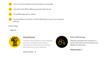
When NFU Mutual needed their new brand implemented on their website it brought with it the opportunity to refresh their site. The initial simple brand implementation lead to further improvements in a larger UX, dev and design perspective.


The project began with bringing in the new simplified colour palette of yellow, black, grey and white into the current sit. It proved more difficult than initially expected, because the limited palette makes it difficult when trying to choose hover states and backgrounds. But the design challenge of the stark yellow and black proved to be a good one and it ended in brighter more exciting website.
The design improvements didn’t stop there, though. There are constant further improvements from a design and UX perspective. It’s allowing for improvements that didn’t happen during the original brand implementation.