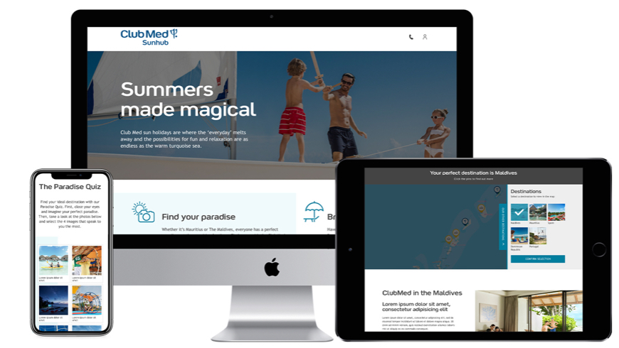
Club Med means luxurious, relaxing family holidays, but not everyone knows what their sunny locations outside of their resorts have to offer. In order to promote their beautiful locations, we created the Sun hub with Paradise Quiz.


When a user gets to the page, they have the option to view the resorts locations or take a short little quiz to get a suggested location that would be tailored to their likes. This project started with a collaboration of the strategy team, UX team, a few members of client services and me. It was an in-depth discussion of what was needed on the site and what users would value most. I was tasked with making the wire frames and designs.
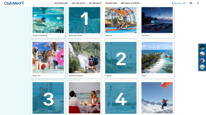
The style was a slight step away from the traditional Club Med styling with the moving blocks in the background, but it was still true to Club Med. I learned a lot from this from creating Wireframes to having to make improvements to the first version due to analytics. I learned that the first version of the design might not work as well as you think. My original design followed past user testing examples, but it didn’t prove to work as well as initially thought. There was quite a high drop off rate, but with the second version it really improved.
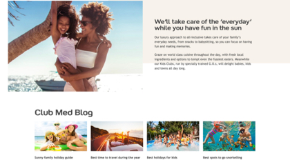
The site used bright imagery and subtle movement of the background panels to get the users to go down the page. I really liked the opportunity to push the Club Med brand slightly and have a page that I could really own.